Account opening with Knab
Improving the on-boarding experience for users opening a bank account with Knab. Looking at the private, joint and business account opening journeys.
Problem & challenge
There are multiple, complex flows. Knab must follow strict legal and compliance guidelines when on-boarding new customers
Striking a balance between smooth on-boarding for users and being legally compliant as a bank
On-boarding must deter fraudulent activity, money laundering etc. Therefore screening process needs to be rigorous, particularly for business accounts
The number of questions when on-boarding can be high, making sign up tedious and time-consuming
Improved functionality needed for users to easily open additional accounts
Approach & method
Used data to identify parts of the onboarding process with high drop off rates
Mapped onboarding flows and user journeys for each type of account opening. Identifying pain points, opportunities and legal/compliance requirements
Worked with stakeholders to reduce the burden on the user whilst still being legally compliant
Conducted rigorous user testing to get a feel for how customers find onboarding and what the sticking points are for them, what’s intrusive and what’s not
Improved UX & UI using a more conversational style for each step, to help reduce the perceived cognitive load of the process
I created a set of animations to give a more human touch to certain scenarios
Example of mapping out the onboarding journeys during a workshop, with complete version (on the right side) for stakeholders. Pain points, opportunities and compliance requirements are all listed and this was used to identify where we could and needed to make improvements.
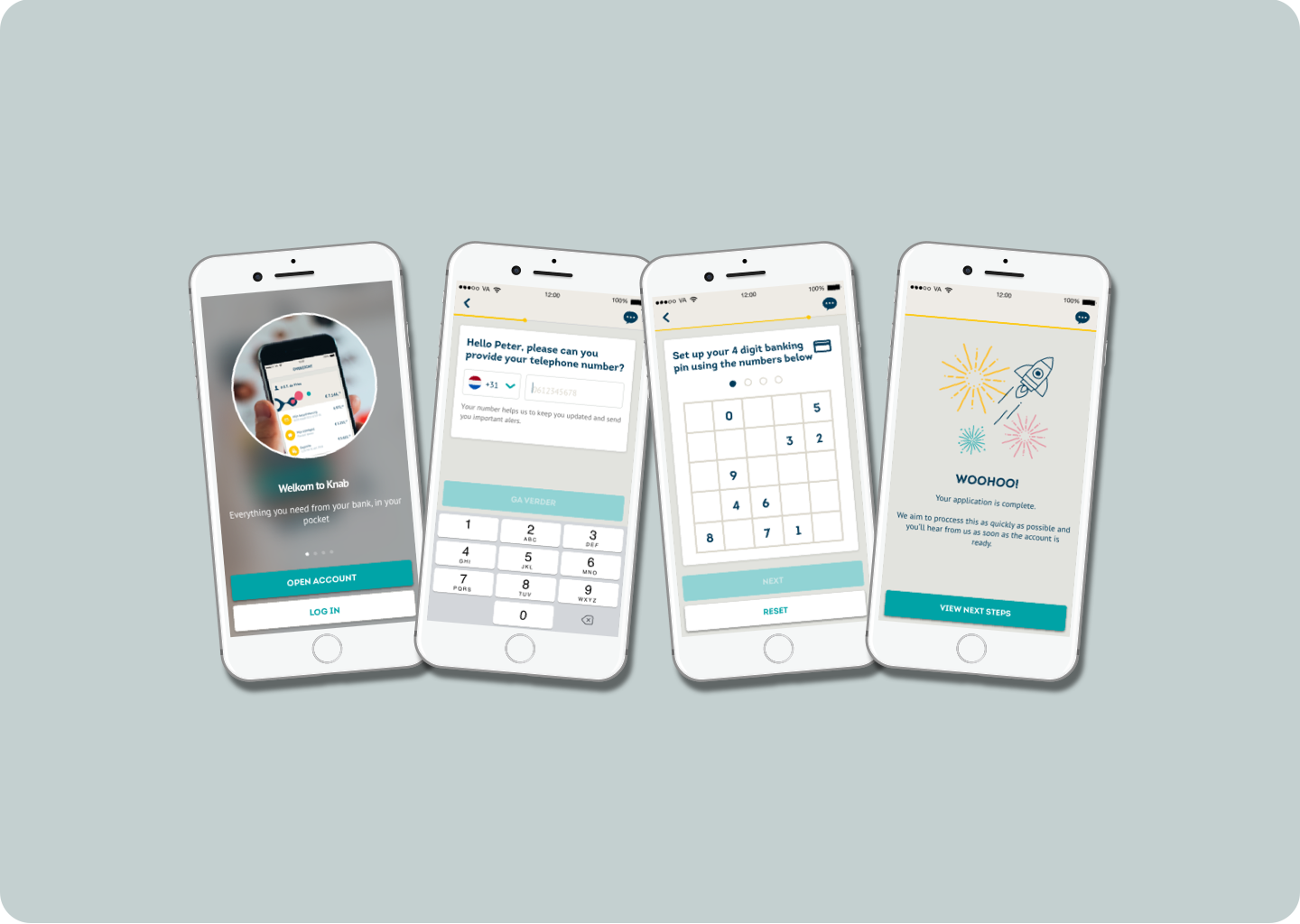
Examples of on-boarding flow and UX improvements. I created a more ‘conversational’ feel to the on-boarding through asking one question per screen.
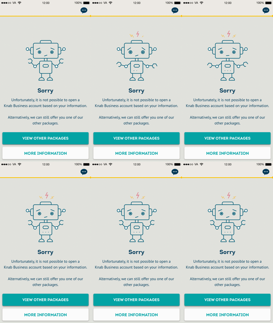
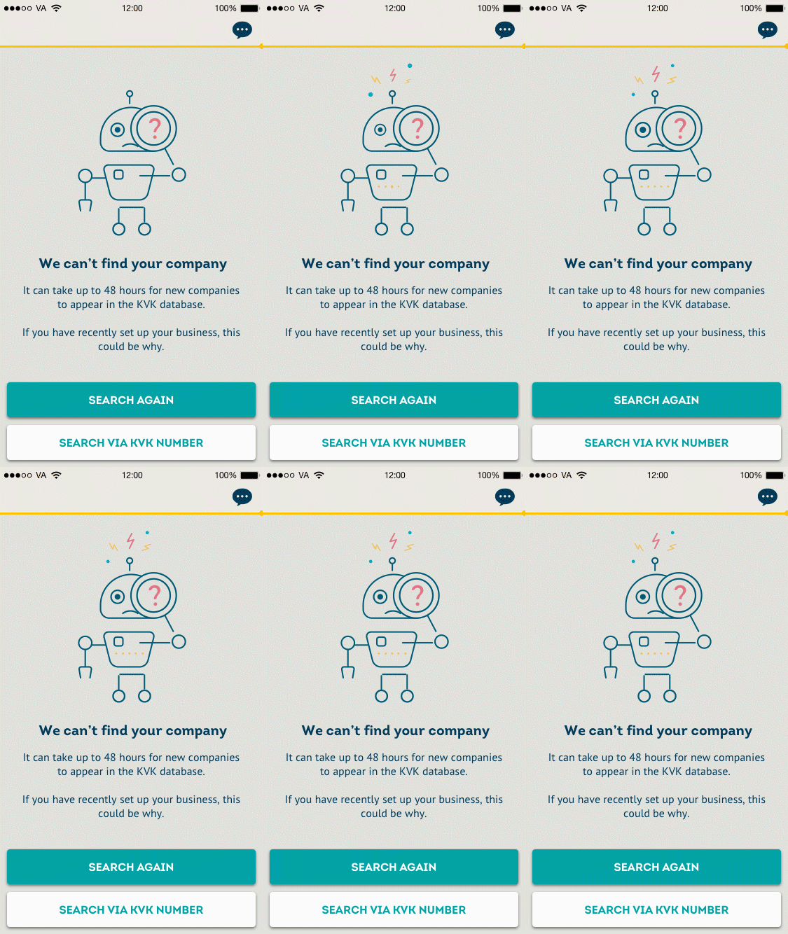
Animations I created for particular parts of the onboarding journey.
Further examples of UX and UI improvements. I created an easier way for users to invite shared account holders to sign up. We also saw a high drop off rate when asking users to scan their passports. I improved functionality to allow users to save their application and return later, once they had their passport.
Metrics
We measured number of app downloads vs the number of successful sign ups complete
We specifically measured the drop off and bounce rates at key parts of the journey we had previously identified to be problematic
Providing photo and passport ID scans previously had a particularly high drop-off. This was improved from 30% to 14% by adding the ability to save progress and return later and adding clearer information on why it is needed.
The conversational style of questioning lead to a 12% decrease in the time it took to complete onboarding for private customers, and a 17% decrease for business customers.


