Otrium shopping cart & checkout
Improving and updating the UX and UI of the shopping cart, checkout and payment process.
Problem & challenge
An old and outdated experience for users, resulting in frustration and a higher than desired drop off rate
Missing key e-commerce functionalities such as click & collect and auto address finder
Poor form field validation
Inconsistent UI and experience across each of the steps in this flow
Approach & method
I user tested the existing and old flow to establish key issues users were facing and where the biggest areas of frustration were
Created wireframes and flow mapping out ideal user journey before moving onto testing and final UI designs
Looked at market standard features that the team felt were essential to be added. Such as click & collect, bike-courier and auto address finder
Writing good UX copy and improving the thank you page to ensure users felt satisfied after purchasing from Otrium
Shopping cart
I designed a cleaner and more user-friendly shopping cart, allowing for products to be easily added or removed. For desktop users, I designed the order summary to stick to the right side of the page, to ensure this is always visible. This is useful when a user has many items in their shopping cart.

Checkout
I broke down the checkout flow into more manageable steps. Users complained that the previous flow felt much too long.
I added an auto address lookup functionality along with multiple delivery options, such as bike-courier or click & collect.

Payment
Extra payment methods were added to ensure all users from all geographies were able to pay in the way that suited them most. Users had the option to save and store details for their next purchase with Otrium.

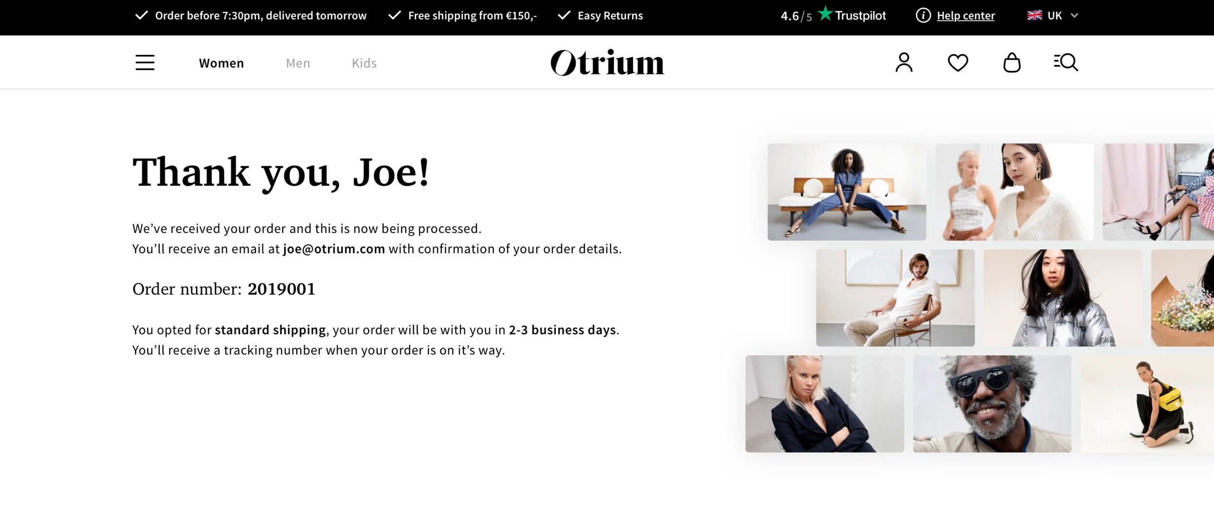
I improved the design, copy, and information available to users at the end of the checkout flow. A vital step to ensure users go away feeling happy and assured with their purchase.